Keeping the Spark, Turning Down the Age
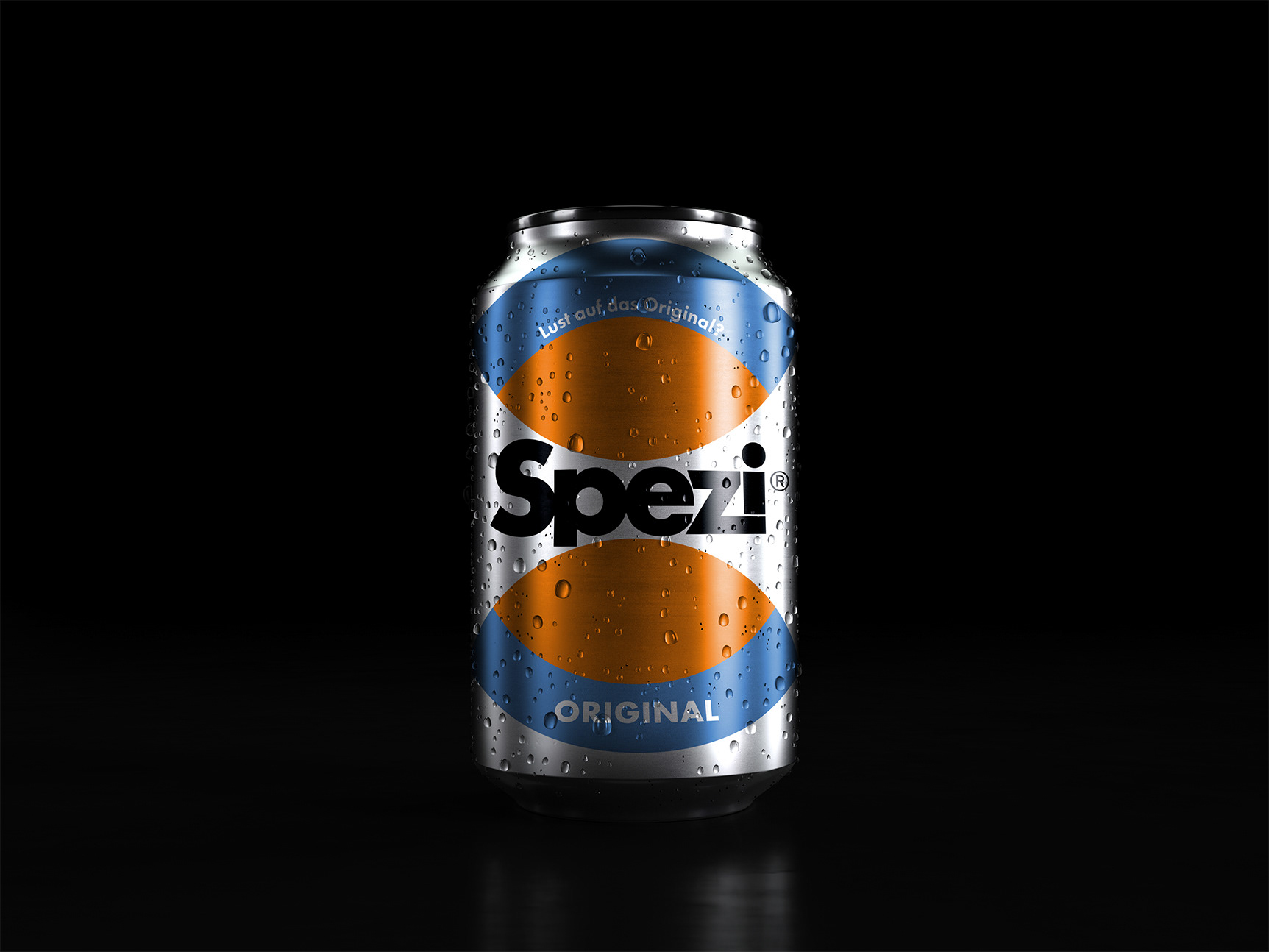
Spezi has always stood for a unique mix and a strong sense of identity. The challenge was to rejuvenate the brand and connect with a new generation of consumers aged 16 to 30, without losing the authenticity that made it iconic in the first place.
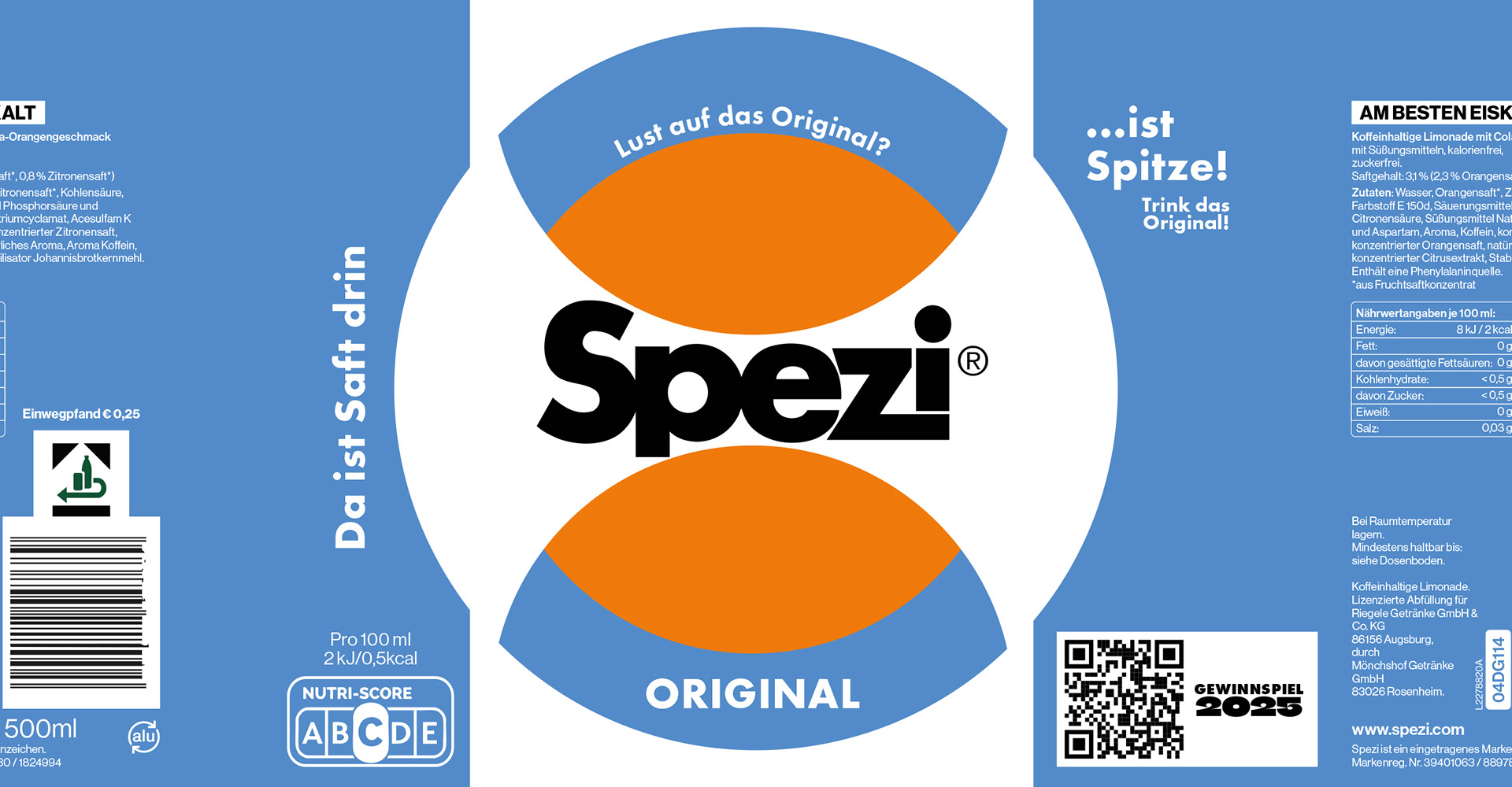
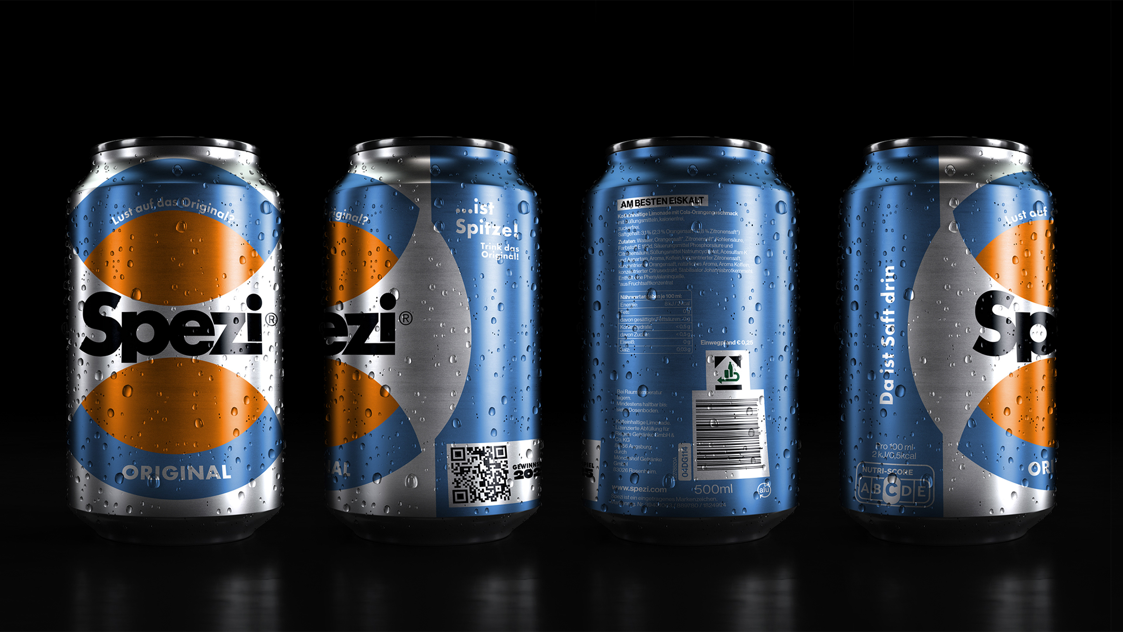
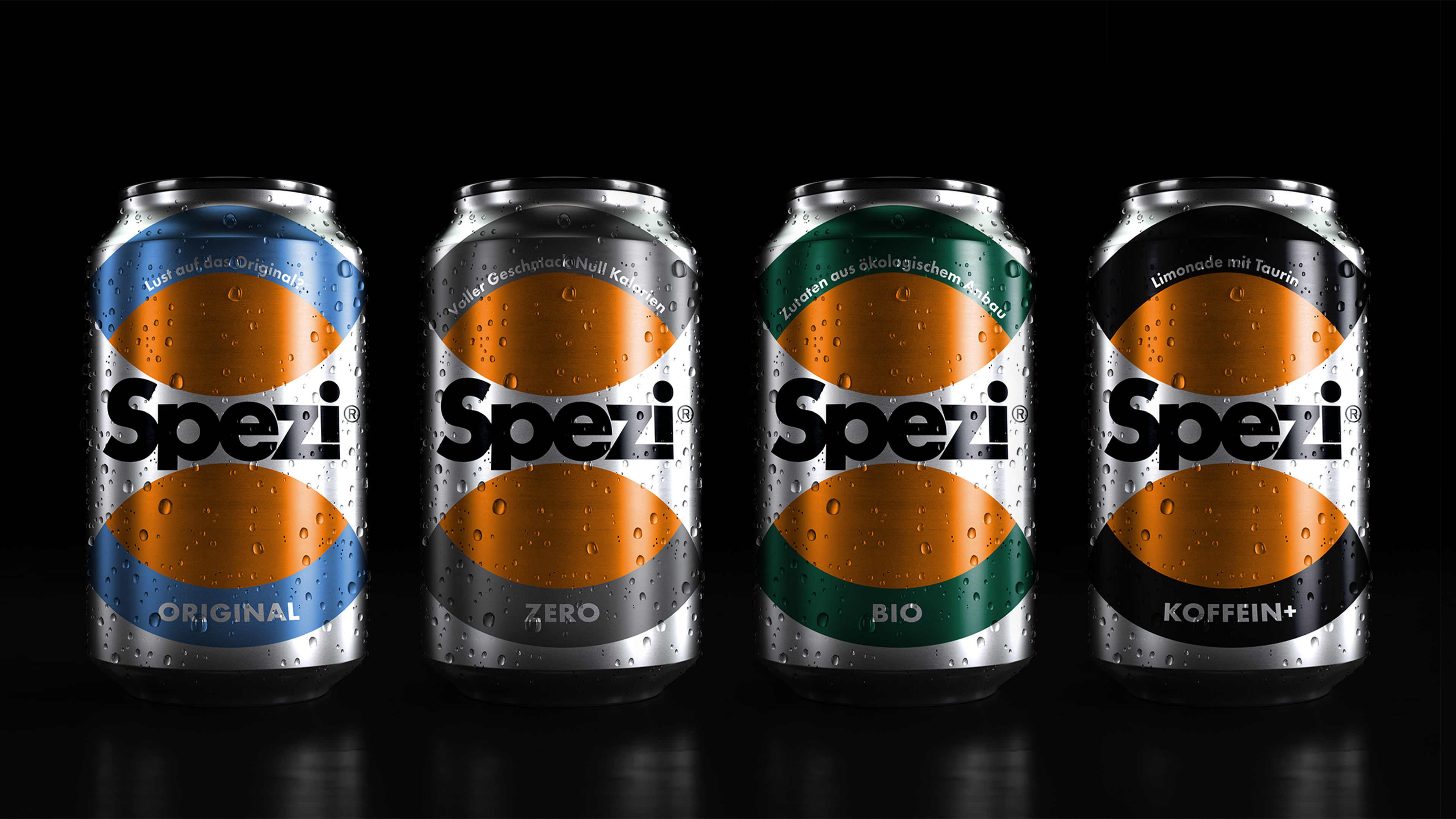
The approach started with the packaging. I modernized the design language and created a consistent look across all flavors, bringing clarity and cohesion to the entire product range. Cleaner layouts, bolder typography and a fresh color system give the brand a more contemporary presence while staying true to its roots.
The result is a Spezi that feels current without trying too hard. Familiar, but sharper. Nostalgic, yet ready for a new audience. A refreshed visual identity that speaks to younger consumers while honoring the character long-time fans love.